The Keys to a Standardized Portfolio.
The MNML team worked with NI to demonstrate how the new design language is used across a range of products and developed a process for critical review that helps their new design team develop an intuitive sense of how to apply the design rules. Our goal was to make every engineer at NI part of the design team by providing clear standards and by reinforcing a culture of design thinking. Our comprehensive design guidelines are a complete toolkit for product design at NI.

The Language of Precision
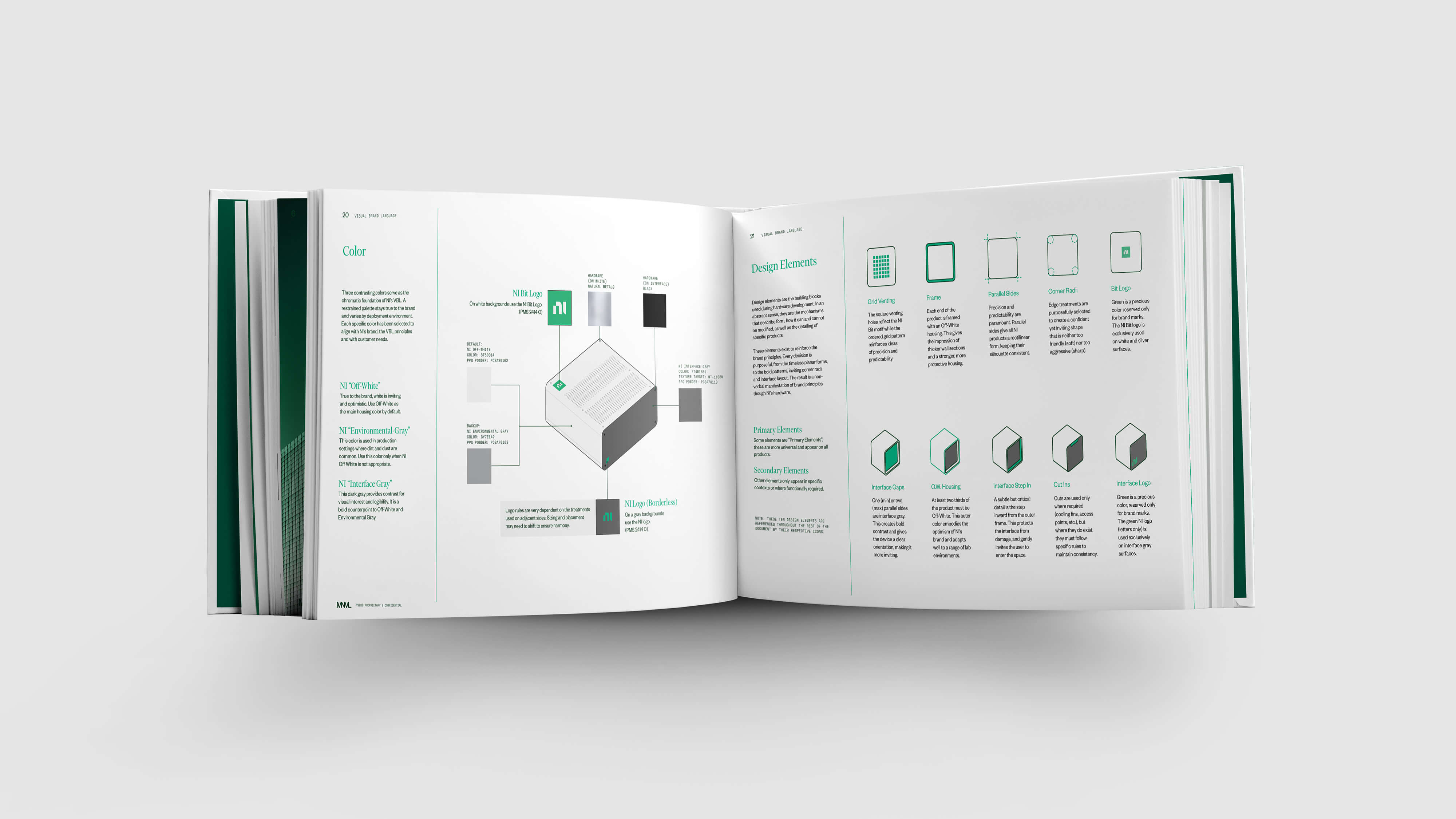
The team used style boards to quickly explore a wide variety of visual themes. By combining inspiration imagery with rough 2d mockups, NI was able to quickly get a ‘10 foot read’ that illustrated a range of color, pattern, and form styles. A simple CMF provides flexible solutions for a complex product family. The language of “Frame” is precise, geometric, and pure. Its bold combination of dark gray interfaces and wrapped white shells provides the user with a clear orientation and consistent interaction point. This consistency is key for nested devices such as server racks that house mulitple PXI modules, which in turn contain many PXI cards.


Concept Development
Sketches were instrumental in the development of design elements flexible enough to be applied across an entire NI family of products. This iterative sketch process generated a large volume of concepts and facilitated technical discussions with NI prior to entering 3D.

PXI
PXI (PCI eXtensions for Instrumentation) is NI's flagship product and serves as a showcase for the new design language. Venting is arranged in strict square patterns, emphasizing precision and order while also echoing the NI logo. The housing is highly directional: dark gray end caps highlight the technology inside and indicate an access/interaction point. These interfaces are recessed on each side, giving practical protection to the ports and space for airflow in the rear. They also serve to visually emphasizing the clean white protective housing which wraps tightly around the technological core.


Design at Scale
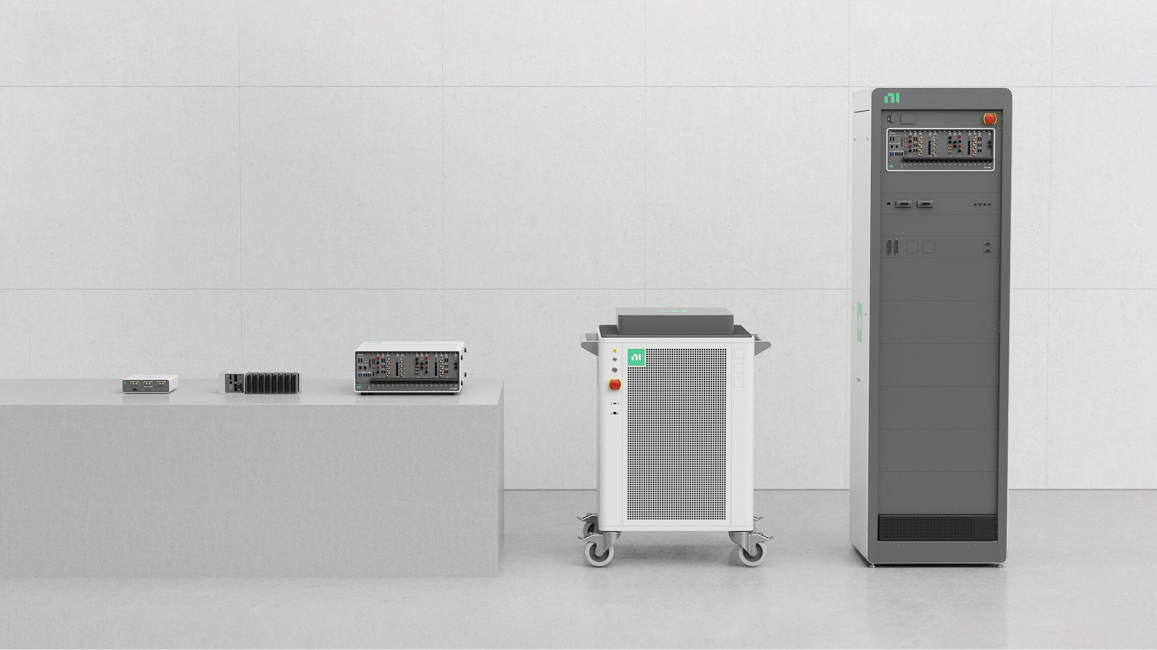
NI’s products vary dramatically in size, making CMF application a challenge. Patterns, color blocking, logo placement, and more required clear design rules that adapted to every scale without losing consistency.
Interface Standards
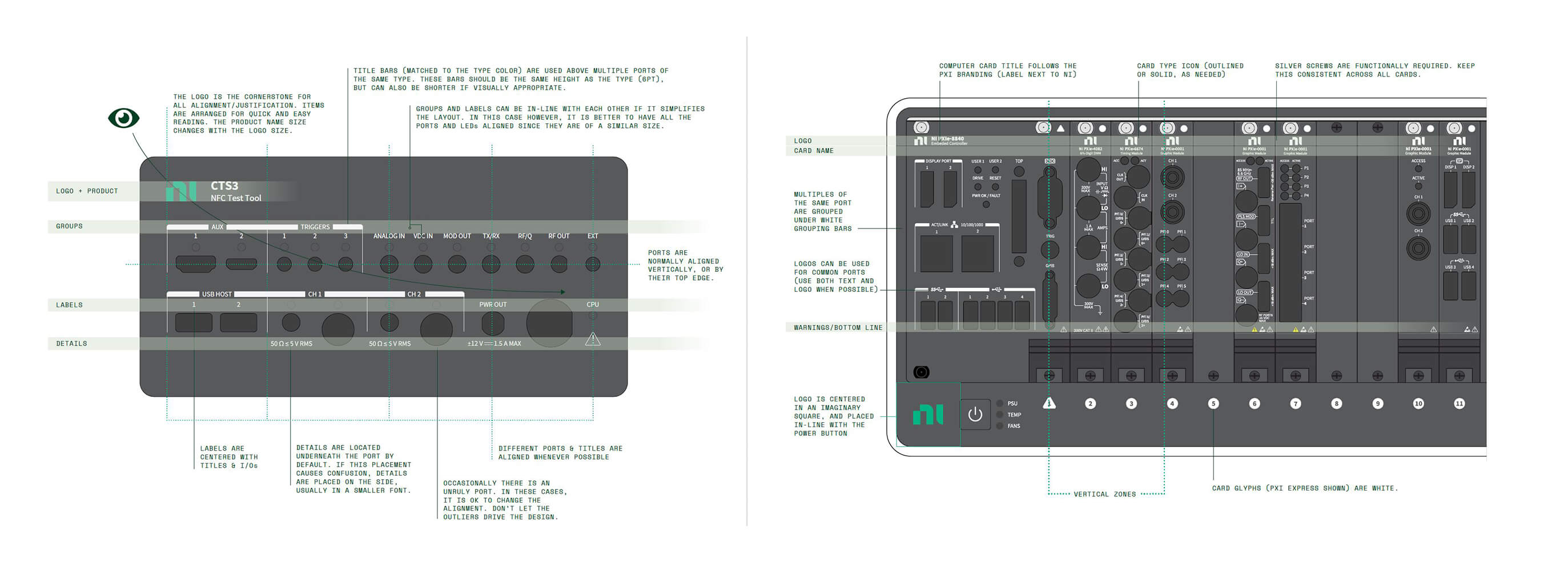
Many NI products are modular systems with virtually infinite configurations. It was critically important to design interface guidelines that bought order and consistency to an otherwise purely functional arrangement of ports. The examples below gives a window into NI’s new card interface standards, including port labeling, alignment, and hierarchy.

Validation
Interface designs and color pallets were validated across multiple prototypes; below, a legibility test of different fonts on various background colors.

Principles in Practice
Each NI product reinforces the visual identity of the brand’s portfolio. A consistent design language makes each device instantly recognizable from afar and reassuringly familiar to use. Through the marriage of design and engineering, NI is able to deliver a superior product.


